2024

EECS 493, University of Michigan

Making Campus Parking More Reliable for U-M Students

UI Design

UX Design

UX Research

Several iPhone screens displaying different parts of the mobile parking app interface

The Problem

University of Michigan (U-M) students seeking parking struggle to find reliable, affordable, and convenient options around campus, while those offering parking struggle to find reliable students to rent their spots to.

Initial Research Findings

To understand the existing mechanisms at U-M for undergraduate students to find on/off-campus parking, we interviewed five target users—students from different academic schools, majors, class years, and of different user types—to learn about their parking experiences and challenges.

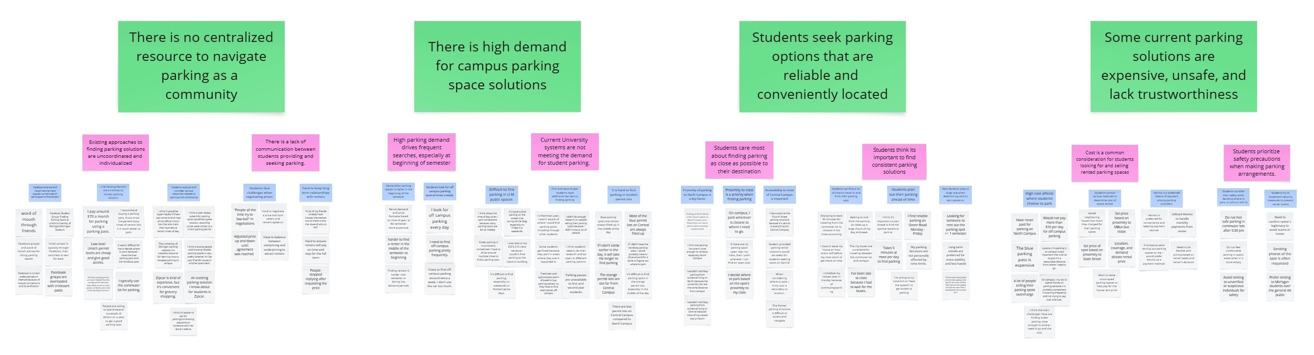
After conducting a thematic analysis on the interview data and creating an affinity diagram, we identified our main user needs and breakpoints:

Need 1: There is a high demand for campus parking space solutions.

Need 2: Students seek parking options that are reliable and conveniently located.

Breakpoint 1: There is no centralized resource to navigate parking as a community.

Breakpoint 2: Some current parking solutions are costly, unsafe, and lack trustworthiness.

Exploring Solutions

Entering the Ideation phase of the Human-Centered Design process, our team started brainstorming potential solutions and storyboarding the most viable ideas. Once we whittled down a list of 80+ ideas to the top nine, we conducted speed dating interviews with four participants to gather quick feedback and validate our user needs. We also received peer feedback on the storyboards from our EECS 493 classmates.

Key Storyboards and Feedback

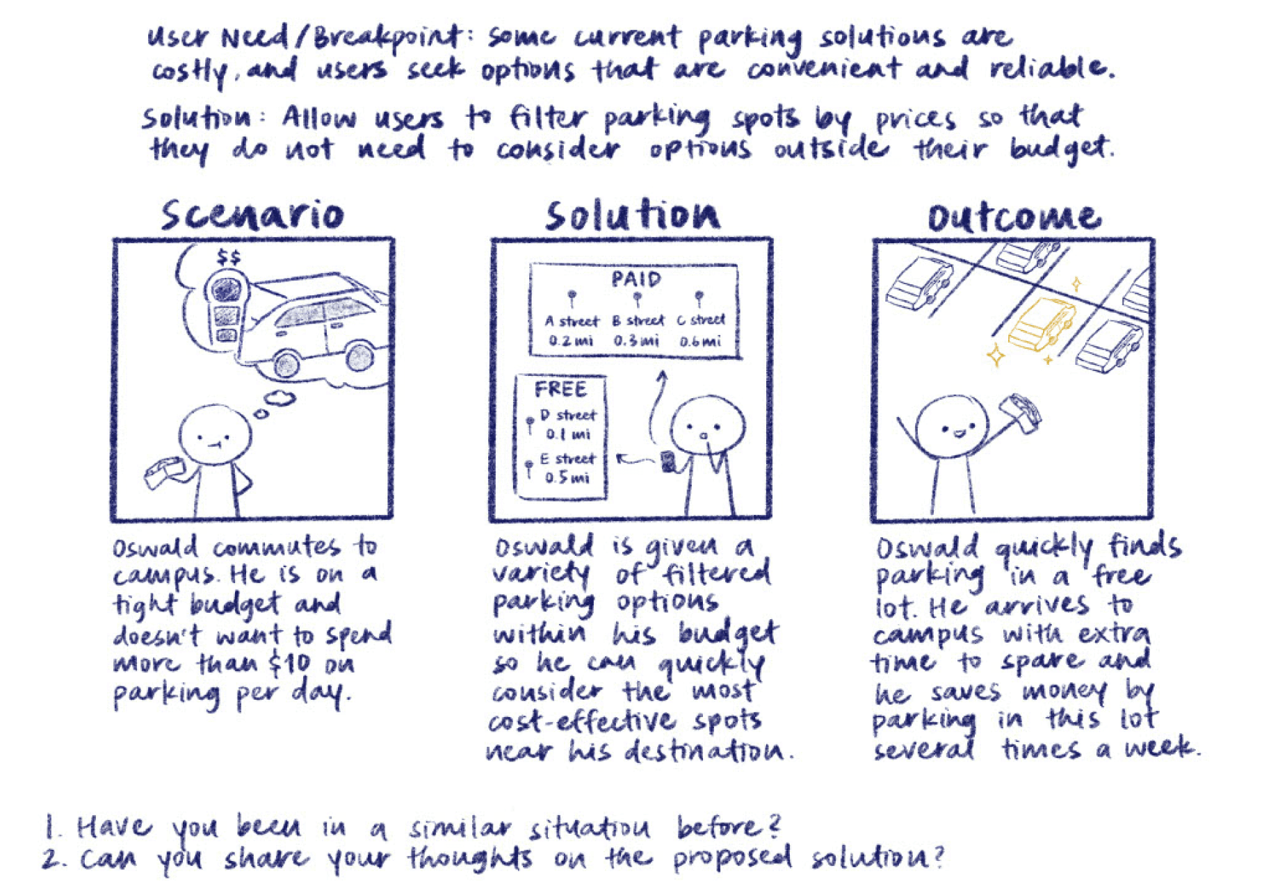
Participants appreciated the notion of a filtering system that would ensure only options meeting their specific needs are displayed.

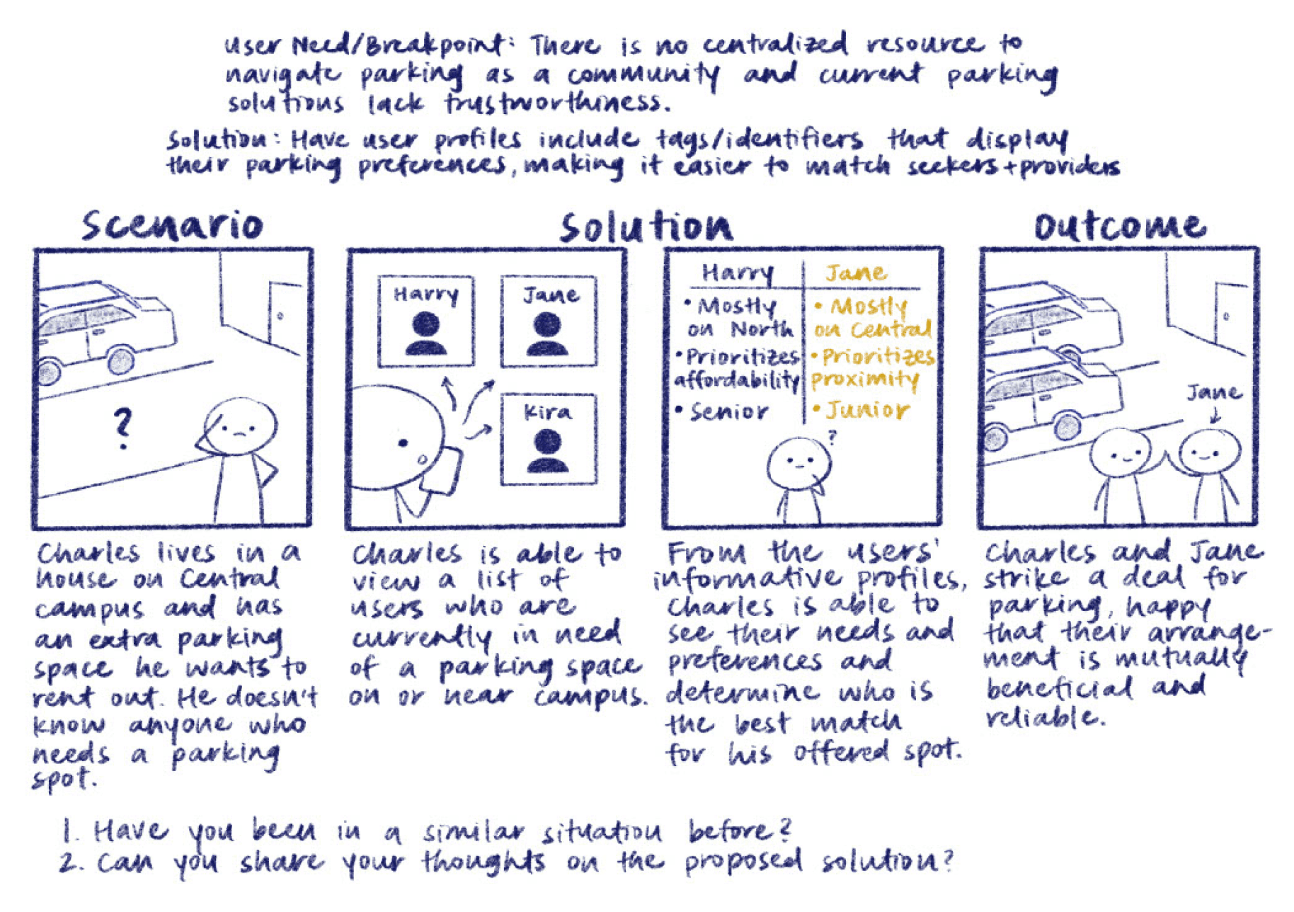
Participants liked the idea of detailed user profiles as well as profile tags to differentiate between renters and sellers.

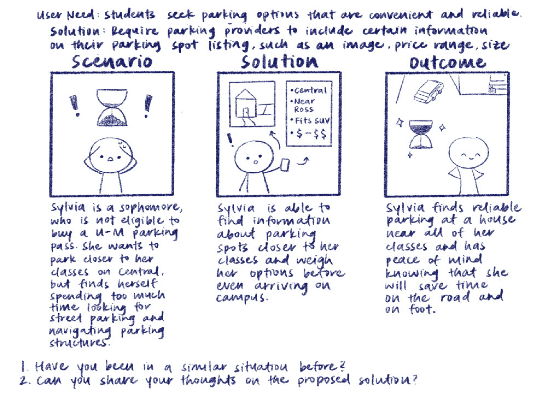
Participants unanimously agreed that having comprehensive listing information for each spot, including reviews from other students, would allow users to better market and locate parking spaces.

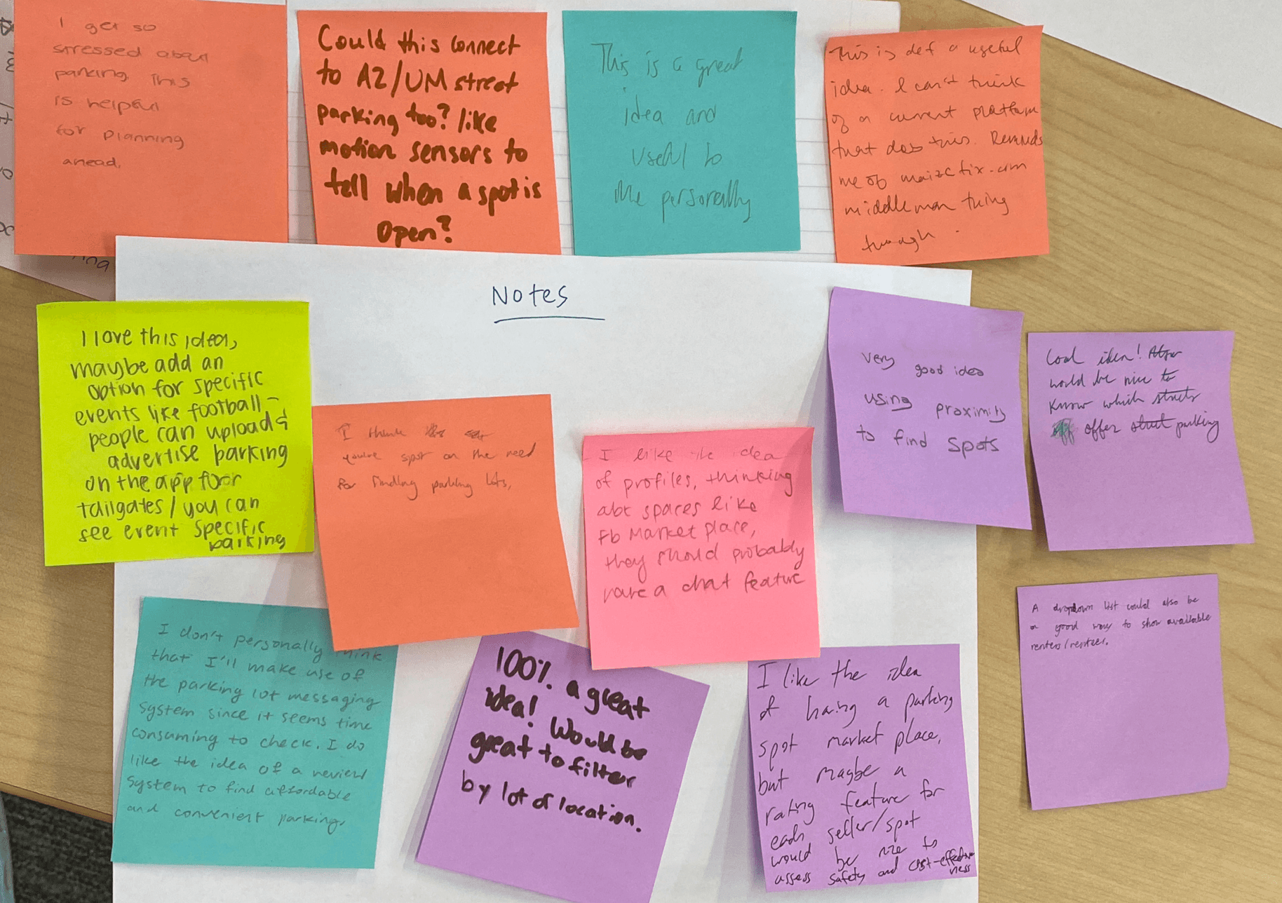
Classmates were receptive to several of the proposed solutions and suggested additional features like event-specific parking options and a way to view available renters and sellers.

Updated Design Direction

Based on these insights, we refined our design direction to help users make informed and efficient decisions. This included providing clear, detailed information for both parking listings and user profiles, as well as implementing filtering functionality to display listings by relevance.

Design Process and Iterations

Guided by our storyboards and speed dating feedback, we began designing the initial wireframes and prototype. We then ran think-aloud usability tests with two participants, asking them to complete two main tasks—each representing a core user flow for a Parking Seeker and Parking Provider.

Task 1: Explore listings and book a private parking space from a parking provider on Central Campus, then end your rental.

Task 2: Create a parking space listing, come to an agreement with a prospective renter, and then unlist the space.

Major Usability Findings

I initially designed several key screens—including the Home, Filters, and Listing Details—and later collaborated with my teammates to iterate others. The designs below include both my individual work and joint efforts with the team.

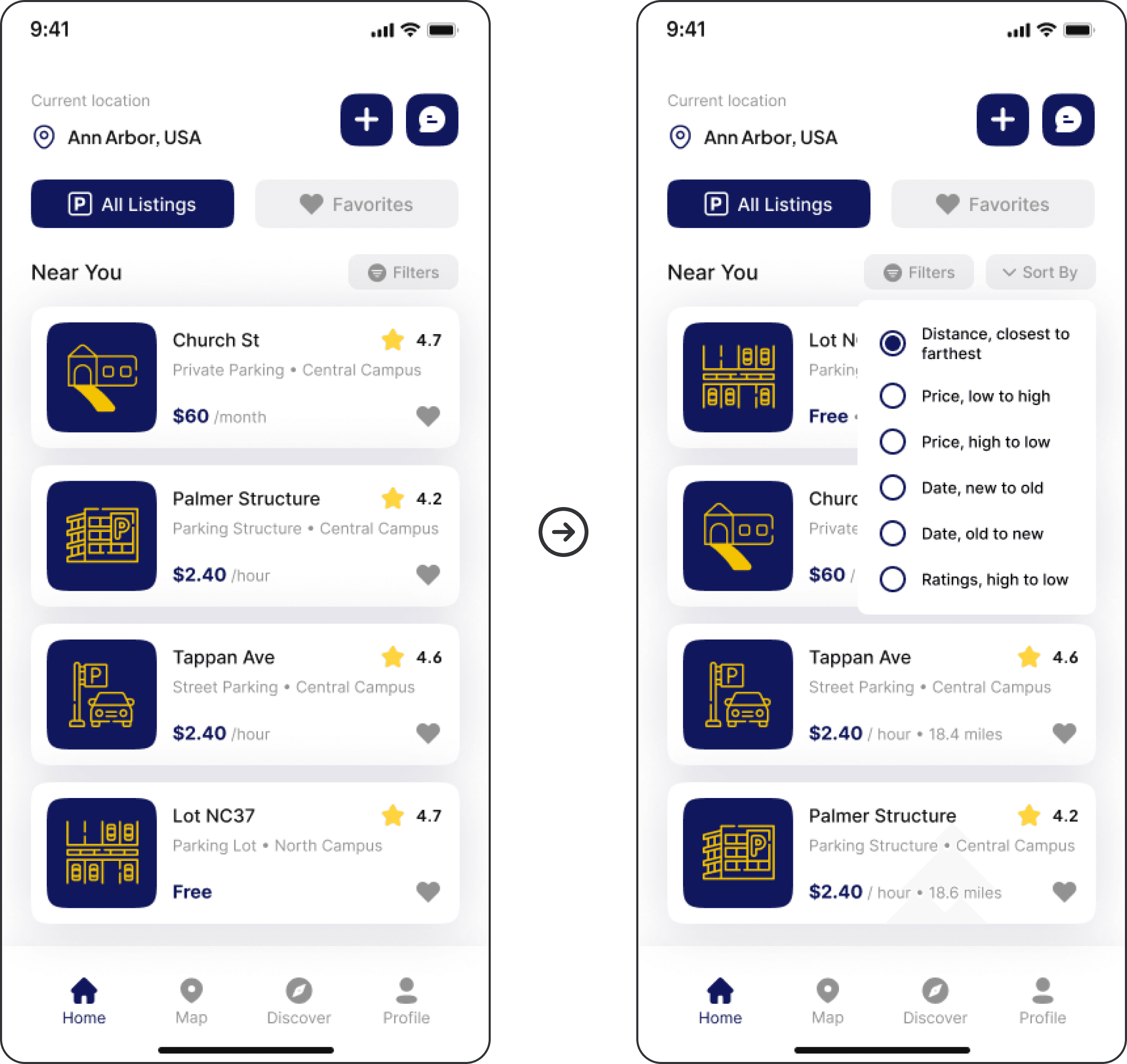
Home - Order of listings is unclear

Added Sorting Option

Placed a “Sort By” button next to “Filters” so users can reorder listings by preference.

Clarified Default Order

Included distance text to show listings are sorted by proximity by default.

Unclear Ordering

User couldn’t tell the listing order or if sorting options besides proximity were available.

Unclear Ordering

User couldn’t tell the listing order or if sorting options besides proximity were available.

Clarified Default Order

Included distance text to show listings are sorted by proximity by default.

Added Sorting Option

Placed a “Sort By” button next to “Filters” so users can reorder listings by preference.

Unclear Ordering

User couldn’t tell the listing order or if sorting options besides proximity were available.

Added Sorting Option

Placed a “Sort By” button next to “Filters” so users can reorder listings by preference.

Clarified Default Order

Included distance text to show listings are sorted by proximity by default.

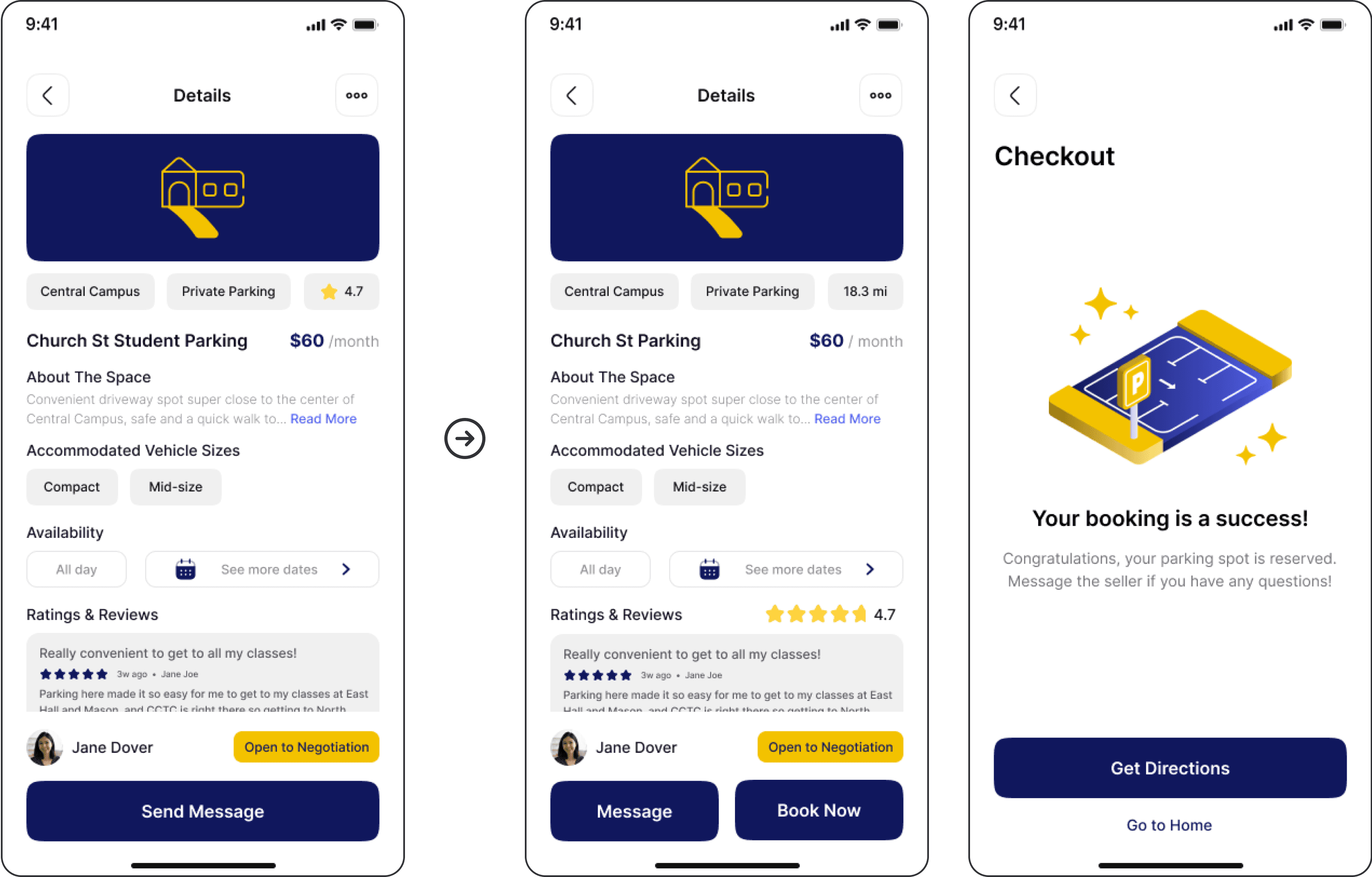
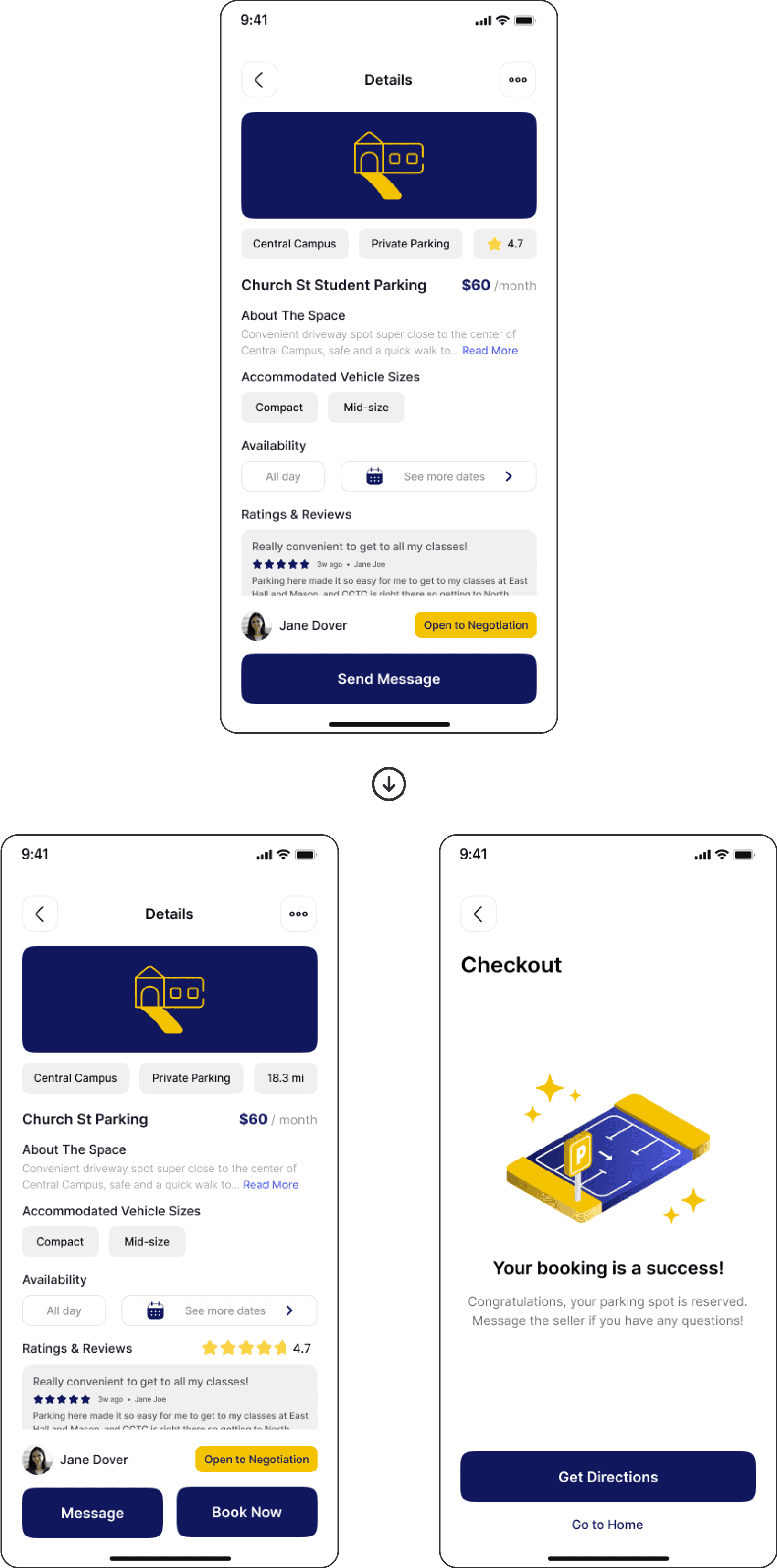
Listing Details - Unclear process for booking parking spots

Booking Flow Confusion

User expected more steps after “Send Message” and didn’t realize booking was complete.

Streamlined Booking Action

Added “Book Now” to simulate in-app payment and let users secure parking without messaging first.

Confirmation Feedback

Added Booking Success screen to simulate a completed transaction with the provider.

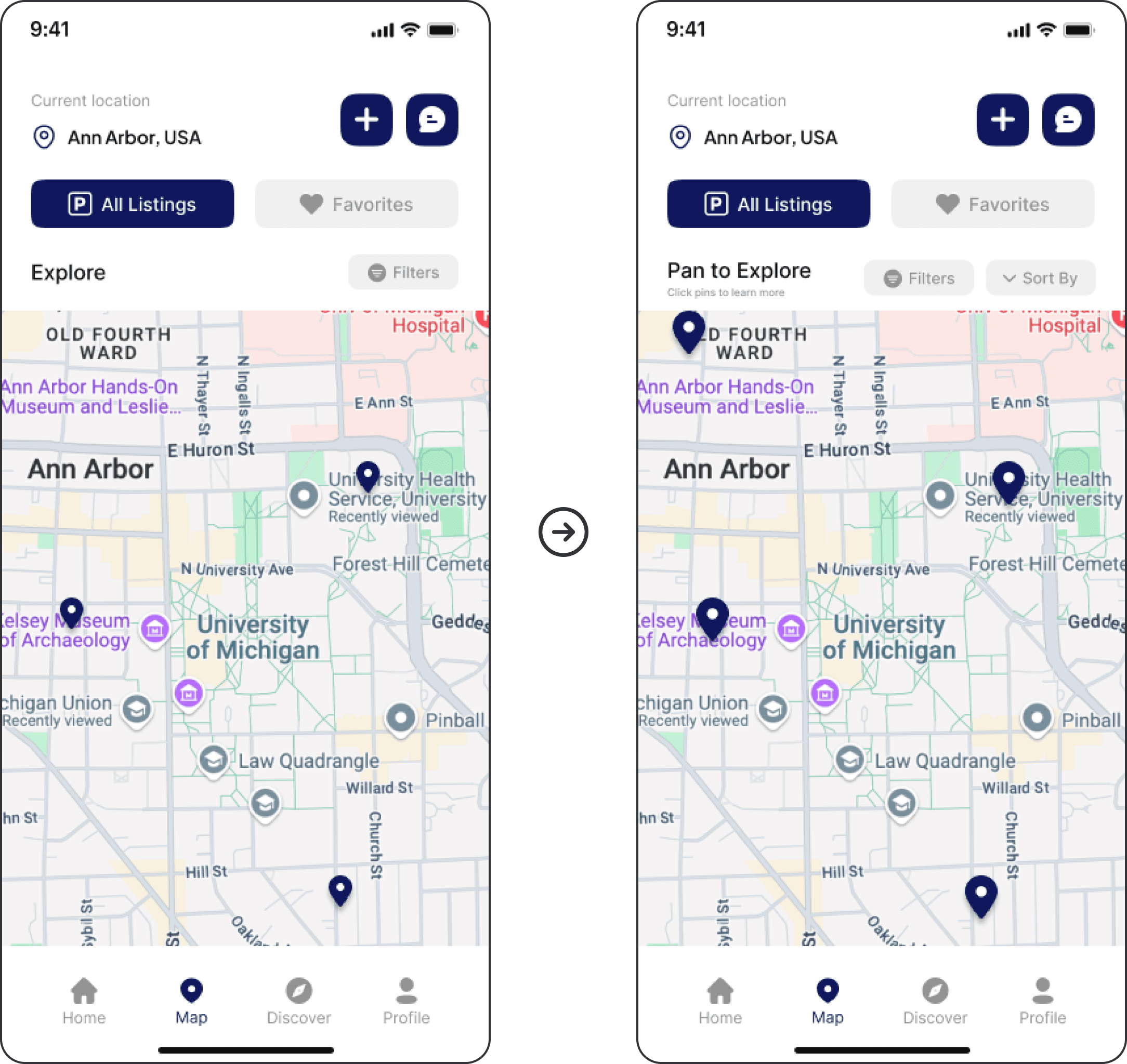
Map - Lack of visual cues for interaction and navigation

Missed Interactions

Users didn’t realize they could pan the map or click pins to view listing details.

Enhanced Discoverability

Changed page title to “Pan to Explore” and added “Click pins to learn more” for clarity.

Improved Pin Usability

Increased pin size to follow Fitts’ Law and improve tap targets.

Pins Too Small

Small pin size made it hard to tap or click accurately.

Missed Interactions

Users didn’t realize they could pan the map or click pins to view listing details.

Pins Too Small

Small pin size made it hard to tap or click accurately.

Enhanced Discoverability

Changed page title to “Pan to Explore” and added “Click pins to learn more” for clarity.

Improved Pin Usability

Increased pin size to follow Fitts’ Law and improve tap targets.

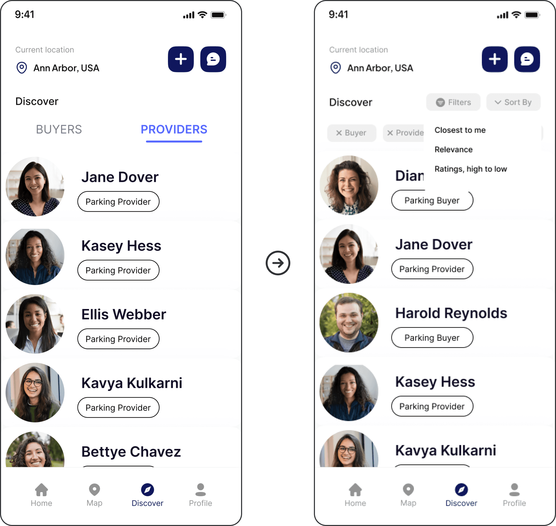
Discover - Unintuitive for finding prospective renters

Unclear Renter Discovery

User first checked Messages to find renters, then was confused by the profile order and presence of providers in Discover.

Organized Profile Results

Added filtering and sorting options so users can browse profiles that are most relevant to them.

Unclear Renter Discovery

User first checked Messages to find renters, then was confused by the profile order and presence of providers in Discover.

Organized Profile Results

Added filtering and sorting options so users can browse profiles that are most relevant to them.

Unclear Renter Discovery

User first checked Messages to find renters, then was confused by the profile order and presence of providers in Discover.

Organized Profile Results

Added filtering and sorting options so users can browse profiles that are most relevant to them.

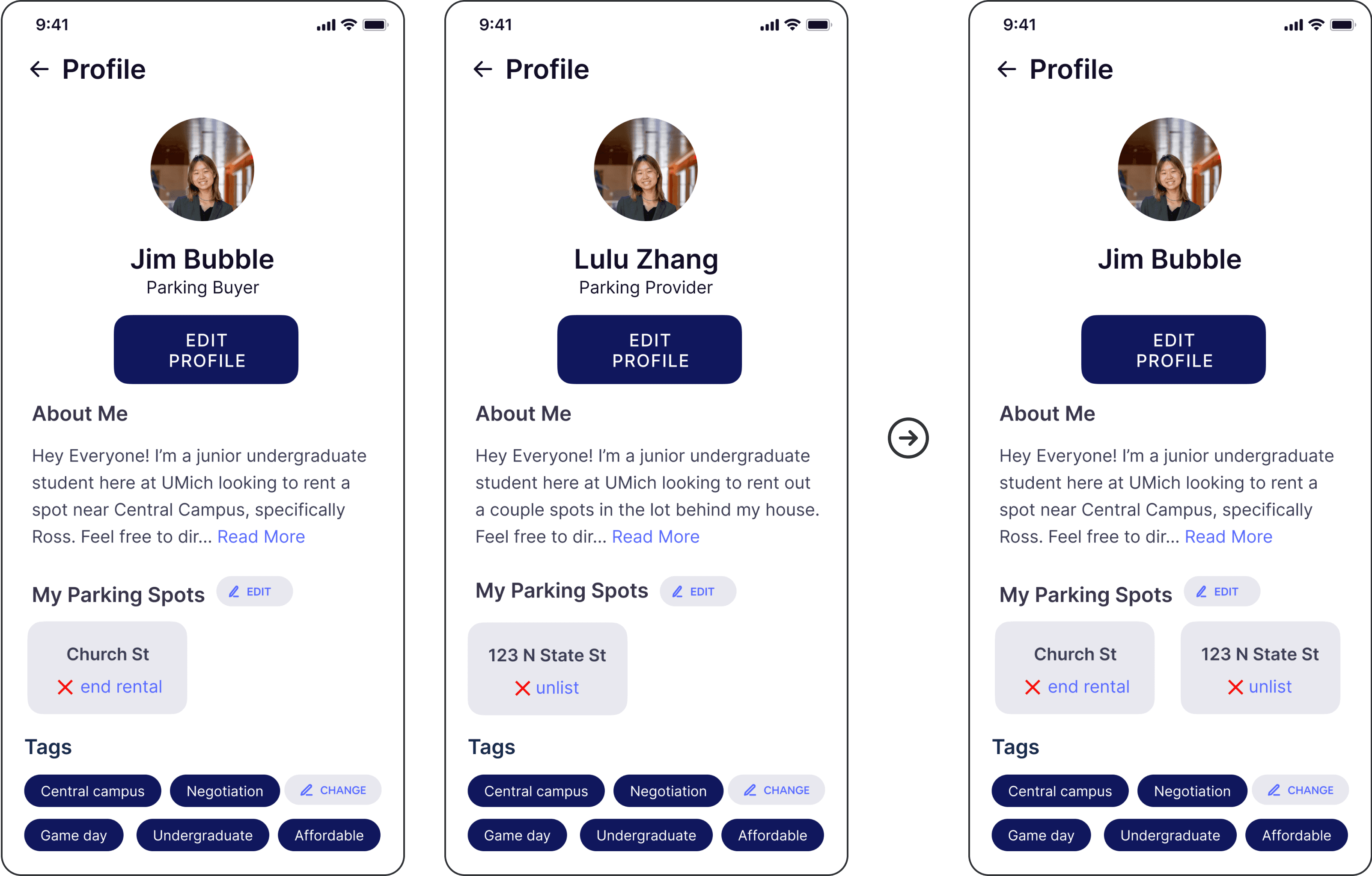
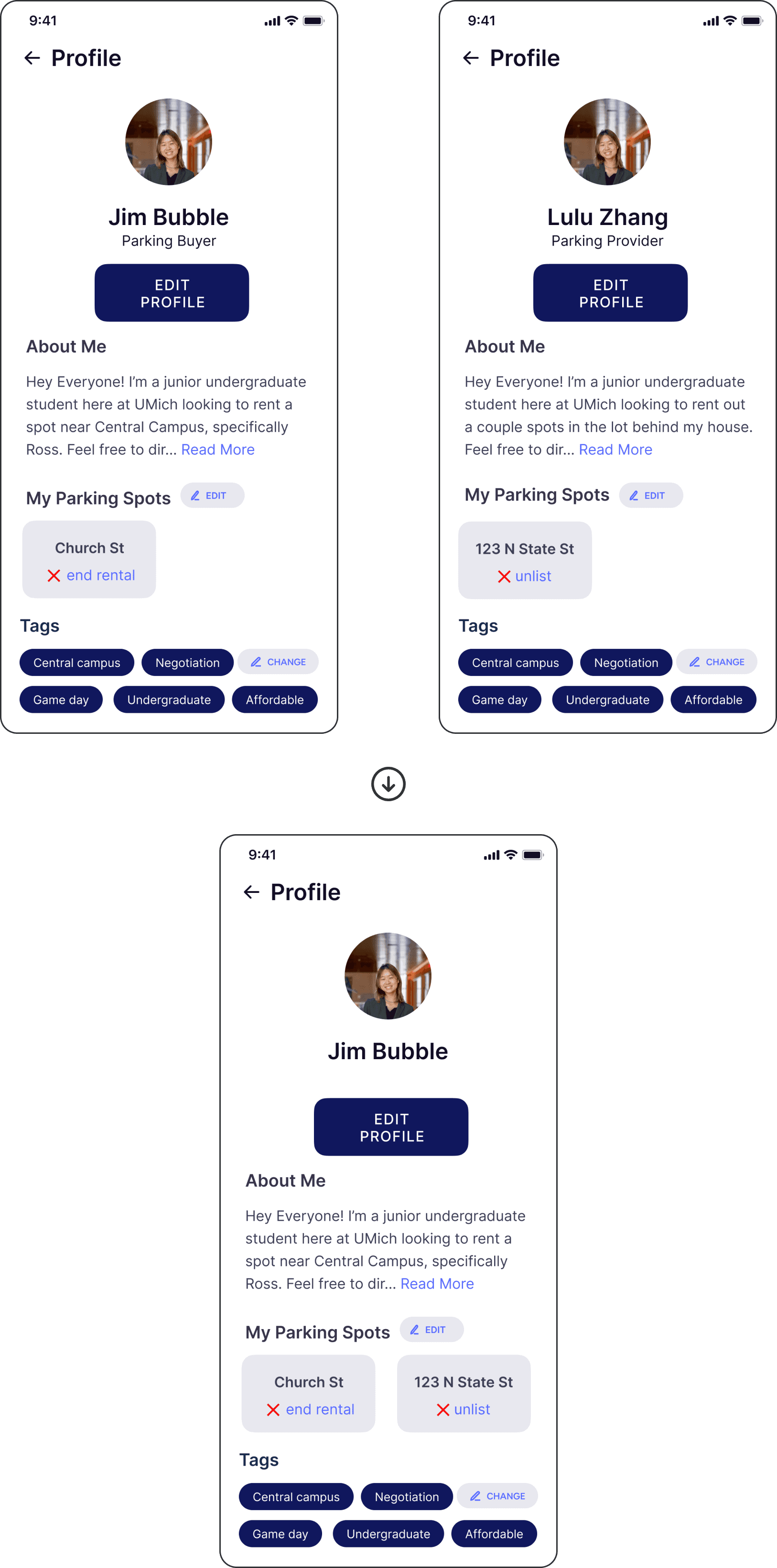
Profile - Dividing Seeker and Provider profiles causes confusion

Profile Switch Confusion

User struggled to switch from their Buyer/Seeker profile to Provider when starting the second task.

Unclear Role Flexibility

User questioned if they could be both a Seeker and Provider at the same time.

Consolidated Profiles

Combined Seeker and Provider profiles into one, allowing users to manage both rentals and listings in a single account.

Additional Iterations

After the first round of testing and iteration, we conducted seven additional usability tests, which confirmed that several of the changes we made had improved the interface’s learnability, efficiency of use, and error prevention.

We also uncovered some additional minor usability issues, though we weren’t able to address them completely due to project timeline constraints.

Final Solution

Watch my team’s final presentation for an overview of the project and demo of the Seeker and Provider user flows.

Outcomes

Overall, I think our solution adequately addresses our overarching problem and user needs. The core issue was the lack of a centralized platform for U-M students to learn about, locate, rent, and sell parking spaces around campus. Our design for a U-M mobile parking application aims to fill this gap by consolidating parking information across the U-M Ann Arbor campuses, enabling students to explore public and private parking options, handle rentals and listings, and easily coordinate with one another.

Learnings

The design process is iterative, not linear.

As hard as it is for me to abandon the desire to make something perfect the first time around, it’s inspiring to know that the designs can improve drastically with continuous iteration—especially iterations driven by quality user data and feedback.

Usability testing is key.

What better way to practice human-centered design than by observing and learning from real people interacting with our designs? Conducting think-aloud interviews was especially valuable in helping me connect and empathize with actual members of our target audience.

It's okay to narrow the project scope.

Looking back, we were quite ambitious in deciding to design the prototype for both Parking Seekers and Providers. If I were to iterate on this project in the future, I would focus on collecting more data from Seekers specifically, and build a more detailed prototype for Seeker functionalities.

Credits

Building off of the following resources, we added different images and icons, modified the color scheme, edited fonts and layouts, and replaced the information on the mockups to fit our project’s purposes.

Templates

Icons

ariefstudio from www.flaticon.com

Cap Cool from www.flaticon.com

Freepik from www.flaticon.com

Pixel perfect from www.flaticon.com

Roman Káčerek from www.flaticon.com

Vector Squad from www.flaticon.com