Building a Donation-Ready Website for Oakland K-9
Web Dev
HTML/CSS
Client Work
The Goal
Our goal was to create a donation-ready website that effectively communicates Oakland K-9's mission and services to educational institutions and potential supporters.
Understanding Client Needs
We held an initial meeting to better understand our client's preferences for the layout and content, and then designed mockups based on his descriptions for the Mission, Services, Donate, and Contact Us sections.

We then focused on creating a simple, professional website that would adhere to the Oakland K-9 brand colors and integrate the images of his dogs as desired.
Challenges and Solutions
Throughout the project, we ran into various technical and logistical challenges, and tackling them effectively required a mix of collaboration, research, and flexibility in our approaches. At the same time, we worked within the constraints of a nine-week timeline, limited meeting hours, and our other academic commitments.
Design Iterations
Our client gave us a lot of creative freedom, so we started by designing mockups to confirm the visual direction. After getting feedback on the layout, text, and images, we began testing different CSS styles, while trying to ensure responsiveness across different screen sizes.
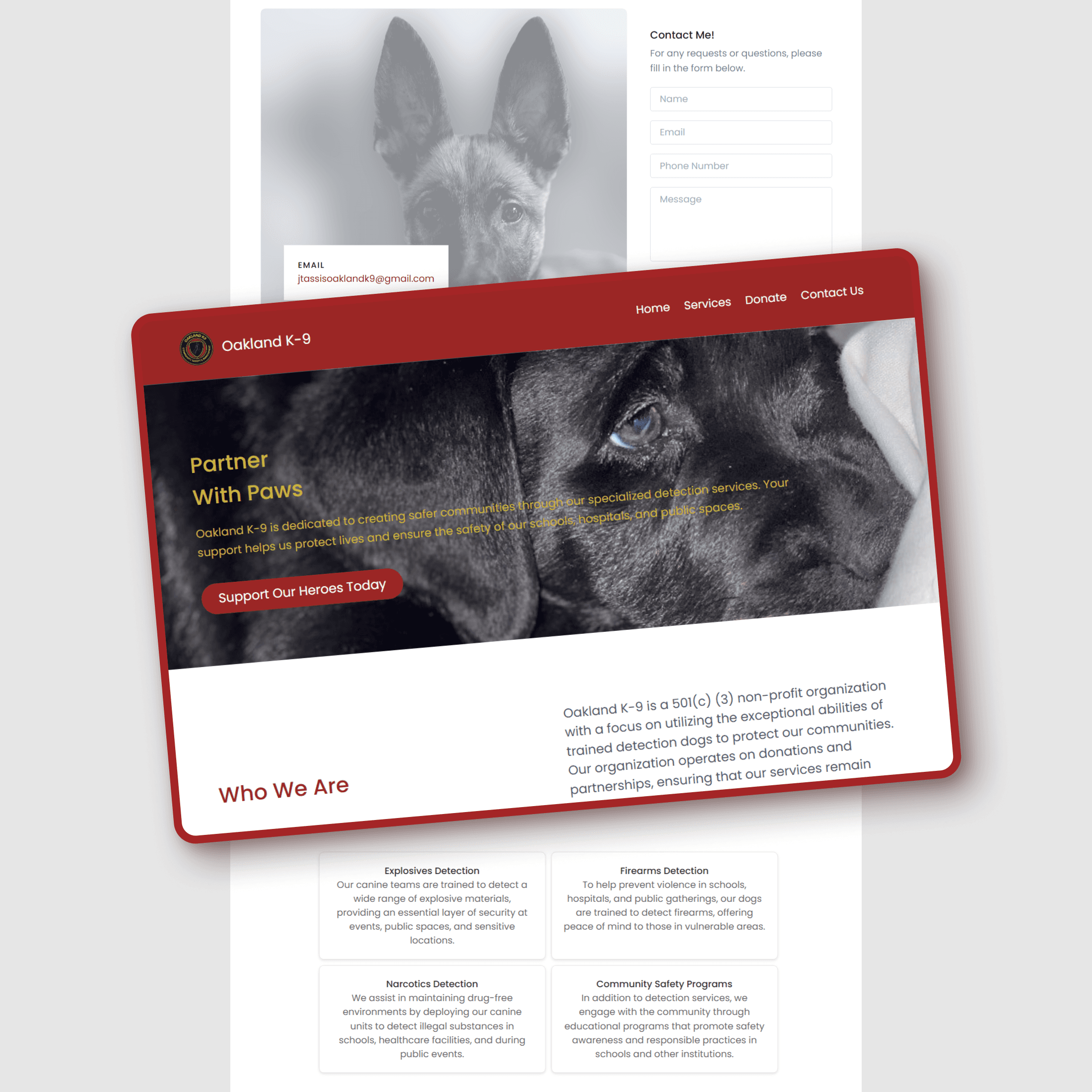
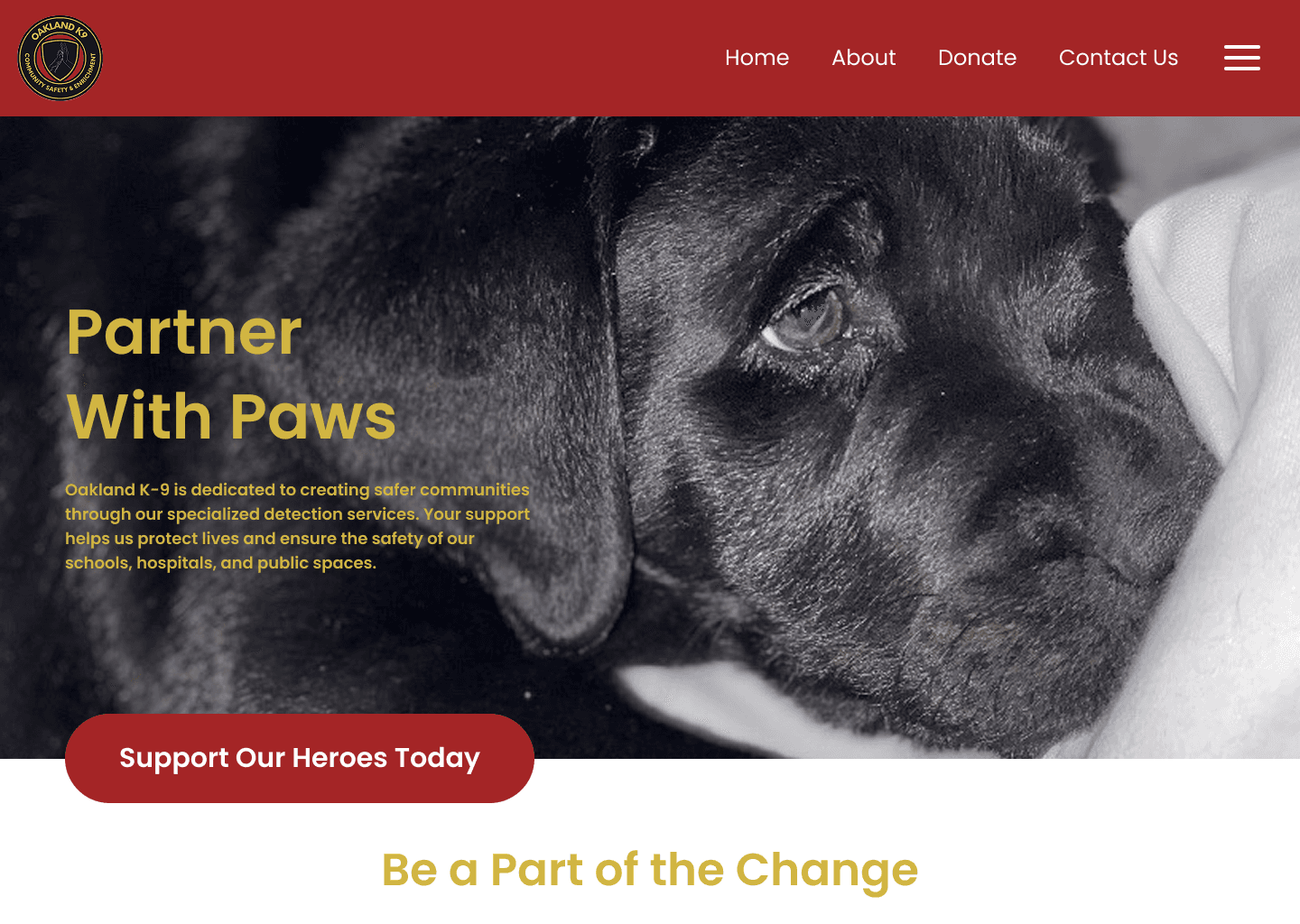
Home Page
On the final Home Page, we reduced text and button sizes due to Tailwind styling limitations and merged the About page content underneath the hero section after revising the site’s information structure.
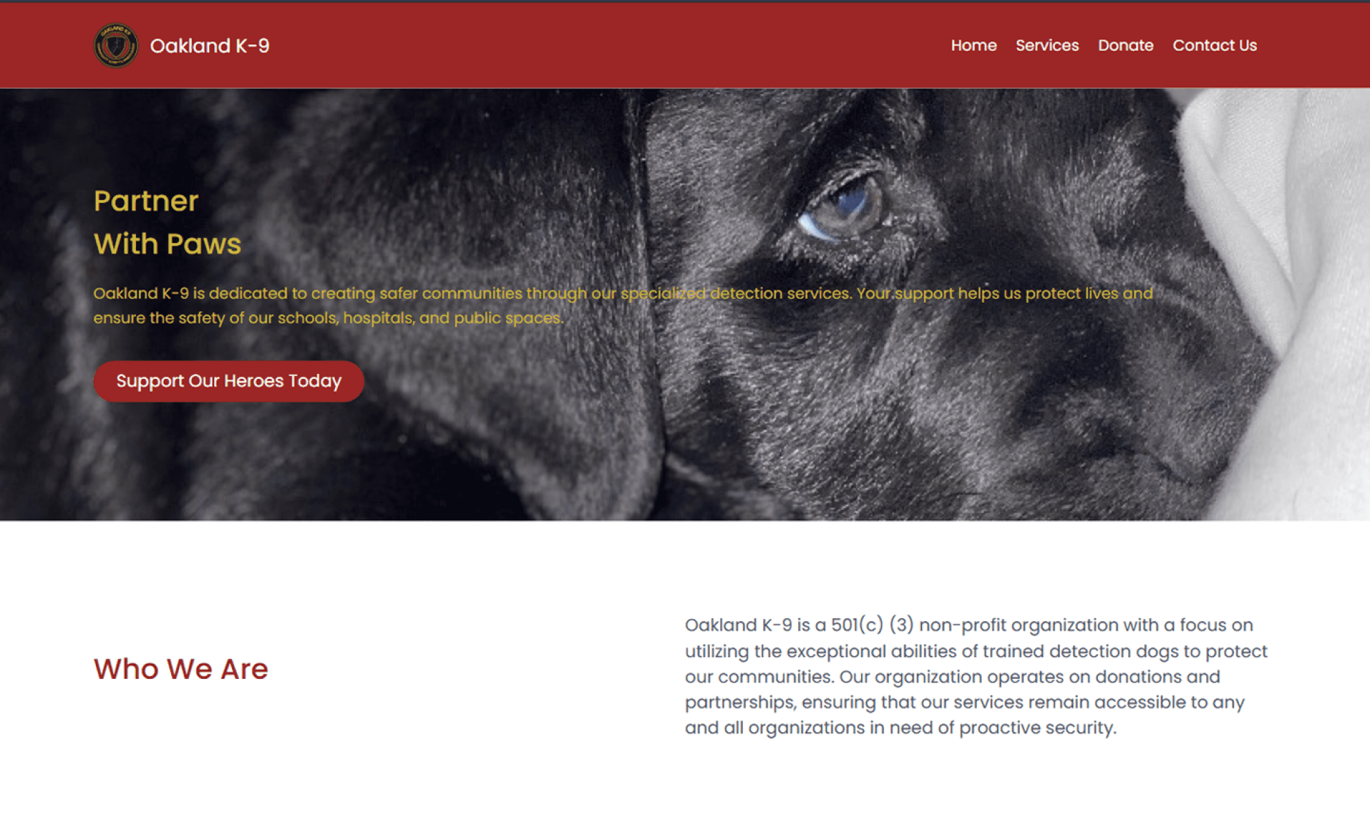
About/Services Page
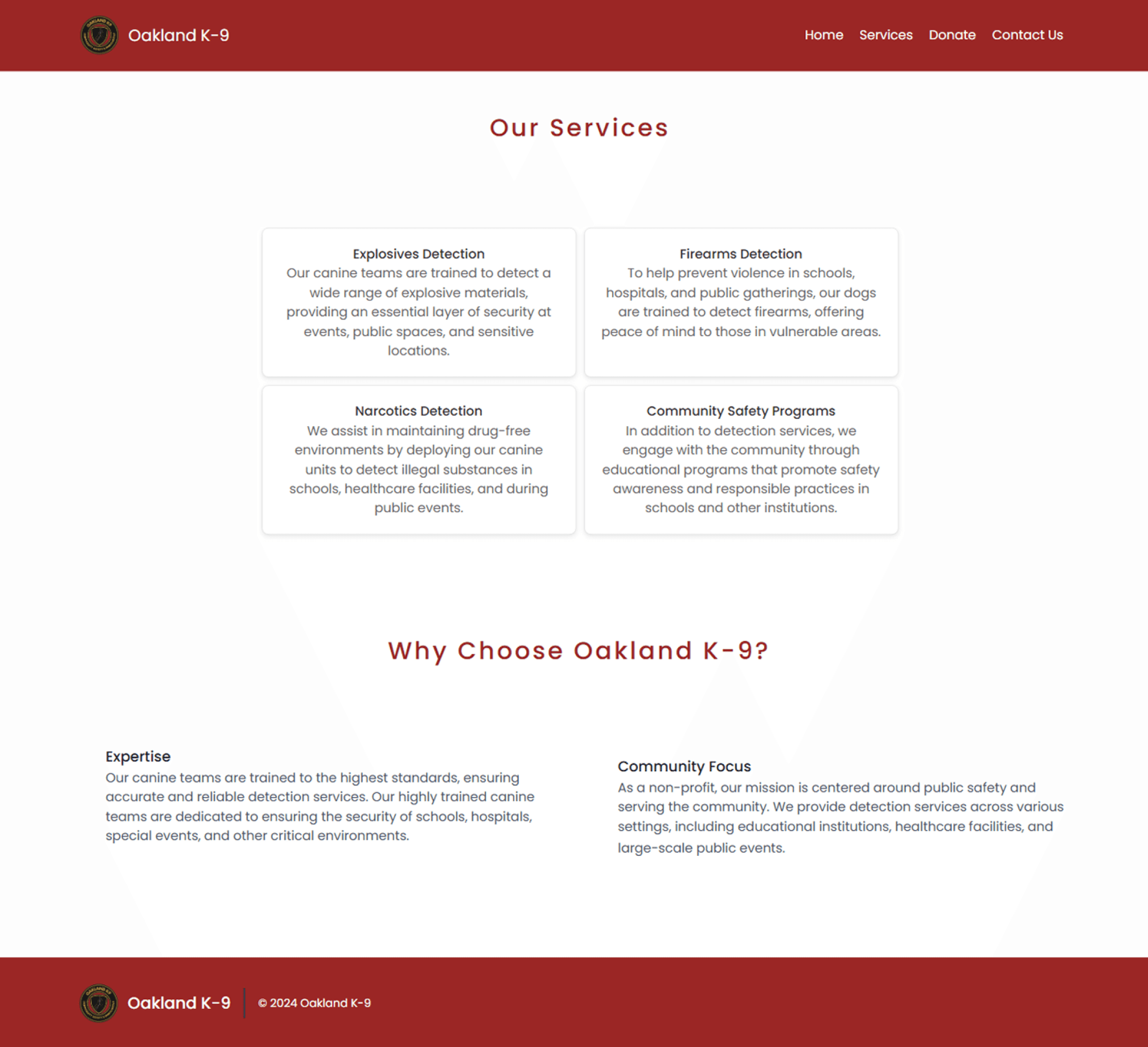
We replaced the original About page with a Services page and used a 2×2 grid of cards instead of the single-column layout to make the four offered services easier to view at a glance.

Donate Page
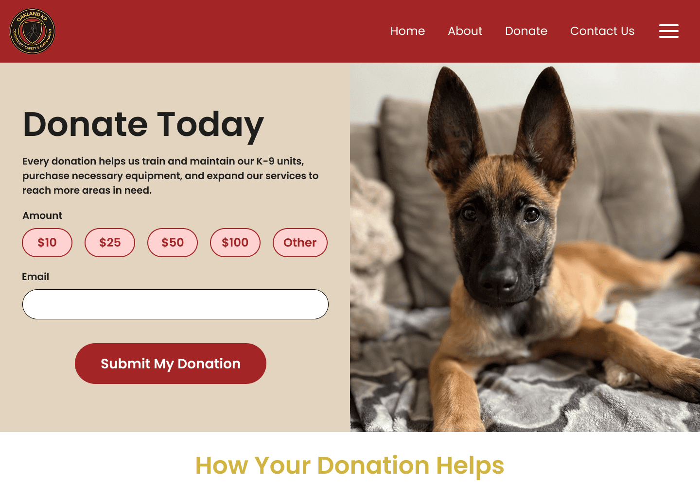
We simplified the design of the Donate page for faster development and easier PayPal link integration, and the client ended up preferring the minimal layout and requested an update to the accompanying image.

Contact Us Page
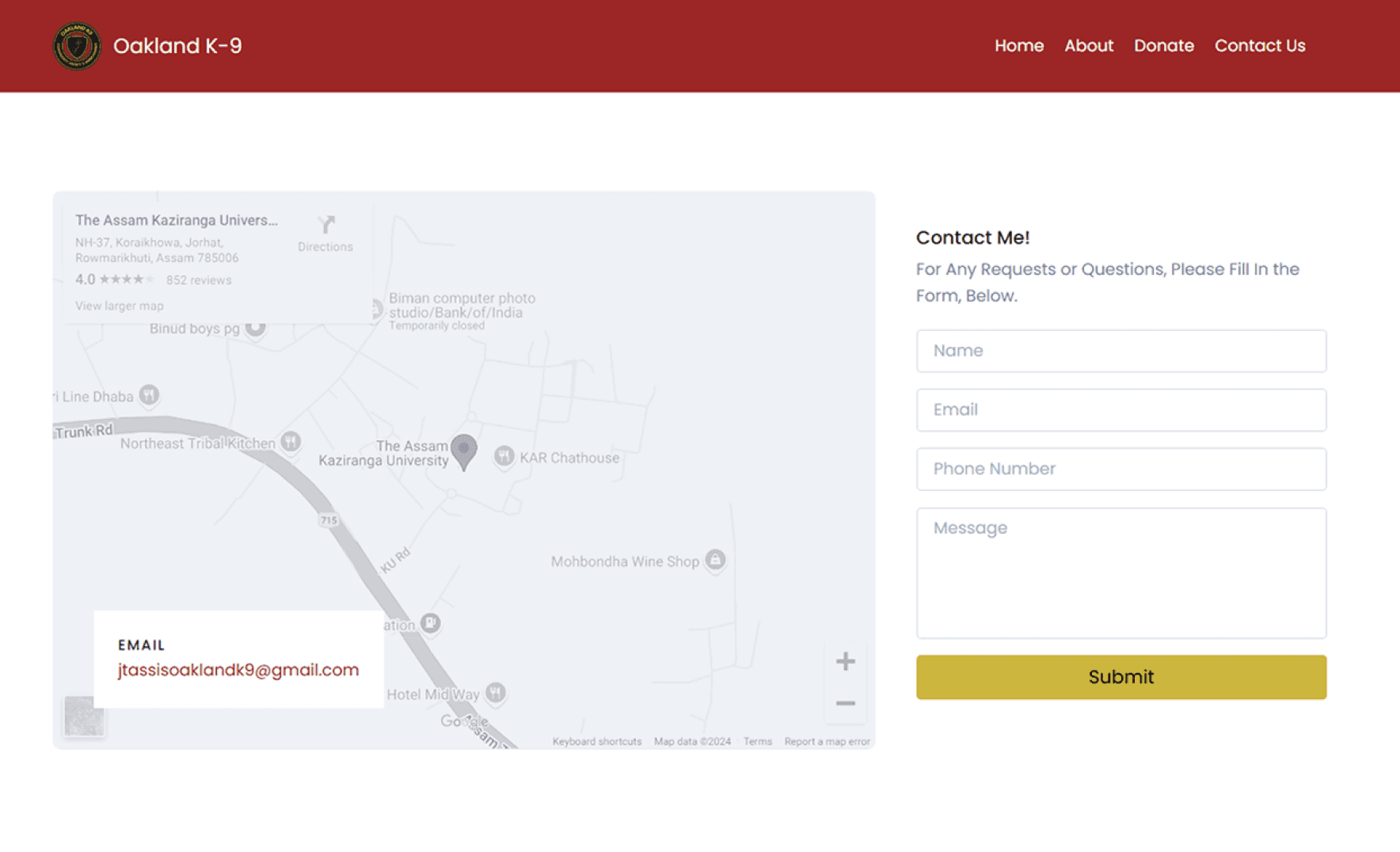
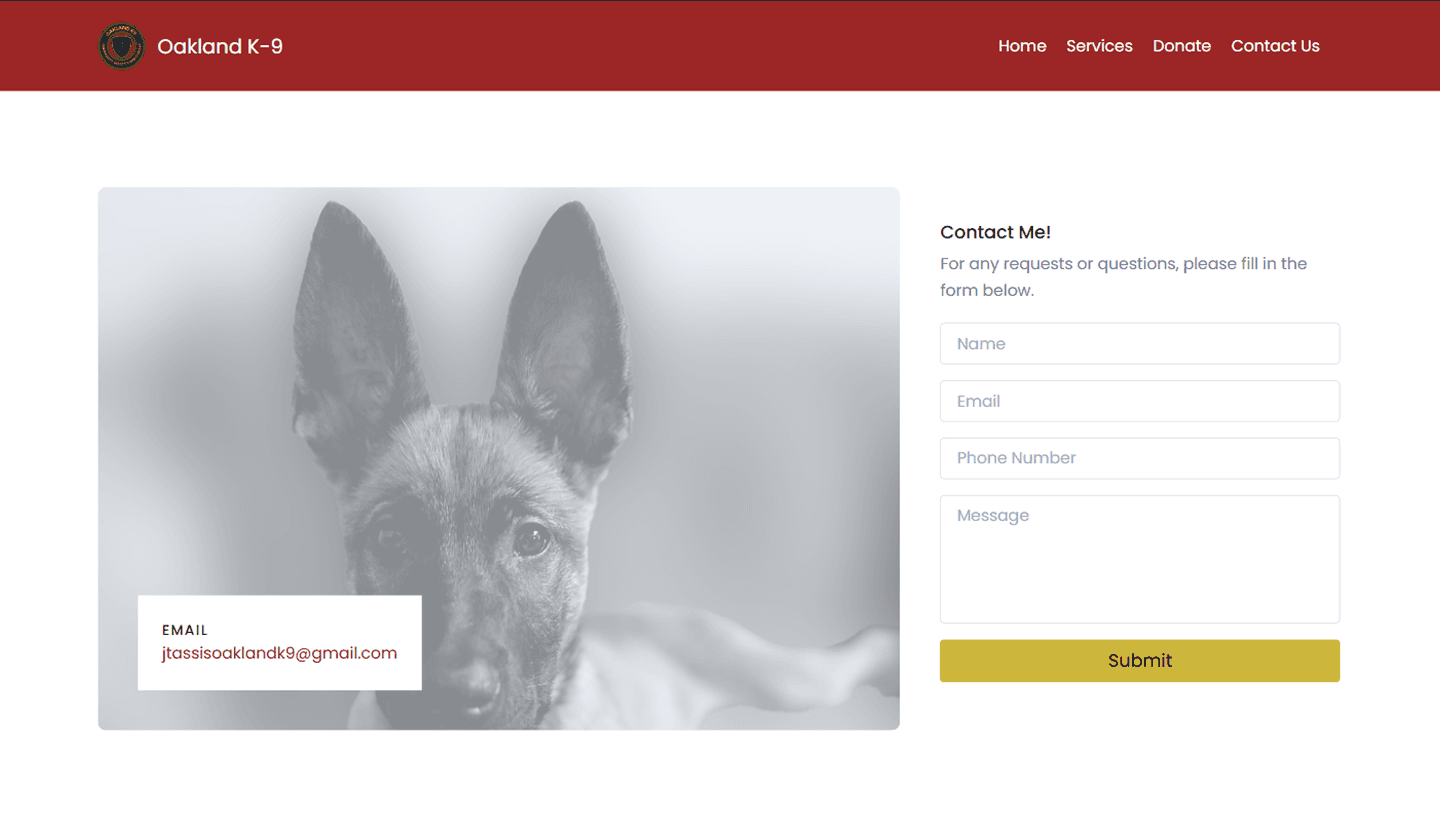
The contact form was configured to send emails directly to the client, and we edited the puppy background image to have a blur effect based on client feedback.
Final Design
View the live site at oaklandk9.org to learn more about how they aim to create safer communities with specialized canine services and how you can support their mission.
Outcomes
Overall, I believe our final website met the client’s core needs; it clearly communicates their mission and services, allows for donations, and establishes a professional online presence for their organization. I’m proud of the functional outcome, and fortunately, the client was very satisfied and appreciative of our work.
Testimonial
"The web design team exceeded our expectations in every way. They worked diligently to create a clean, modern, and user-friendly website that effectively communicates our mission and services. Their attention to detail and willingness to incorporate feedback throughout the project ensured that our website met and surpassed our expectations. Since launching the site, we have seen a noticeable increase in client inquiries, donor engagement, and overall awareness of our services."
- Jonathan Tassis
Learnings
Done is better than perfect.
While I believe that the styling could better reflect the mockups and be improved for accessibility, I recognized that refining the design was of lower priority than creating a functional minimum viable product.
Research your tools, even on a tight timeline.
In this scenario, I initially thought it would be more efficient to "learn by doing", but I later realized it would have been more helpful to spend time upfront researching our tools (especially the Tailwind CSS framework) than to try to fix all of the minor issues through trial and error as they came up.
Remember to design for sustainability.
Looking back from a project management perspective, I think the more sustainable solution for our client would’ve been a site created with a drag-and-drop website builder. Our team assumed it would be ideal to code the website because that approach aligned with our group's skillset (as members of a technical consulting student organization), but realistically, a coded website doesn't allow our client to easily make changes if needed.
Credits
Building off of the following resources, we added relevant content and modified the styling to fit our client's brand.
Templates
Donation Website by Sajid-Borah
Resources
How to Buy and Register a Domain at GoDaddy by GoDaddy Help Center
Add HTML or custom code to my site from GoDaddy Help
How to set up GoDaddy domain with Github pages by Heejin Sim
How to put an HTML website online (on the Internet) by SuperSimpleDev
GitHub Pages Reference by SuperSimpleDev